How to draw ‘People in Perspective’

This technical drawing workshop was all about drawing people in perspective. Incorporating human figures in interior design plans is a necessity when detailing the scale of the building. Adding sketches of human figures gives a sense of scale and brings the space to life, adding people to a drawing also gives a sense as to how the space will be accommodated. With this in mind, this session focused on how to illustrate these figure drawings effectively, we were shown how to draw realistic figures using simple drawing techniques.

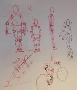
The first technique which Brian had us do was to illustrate each limb on the figure drawing as a circle, and then connecting all of these together to create the body parts. As this was our first try at figure drawing we didn’t have to be too detailed and each element was just a basic shape. Here are a few personal sketches to show the process.
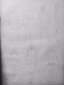
12218834_1245357072148401_1005747639_o-e1447105121755
Brians’ board sketches of how he wanted us to illustrate the figures, he drew a variety of figures in different positions and postures so we got used to different ways of displaying them.
FullSizeRender (3)
It is good to experiment and test drawing different sized figures in different positions as sometimes we will want to represent children/adults in our figure sketches. These are my first sketches, and overtime the quality of these will become much better.

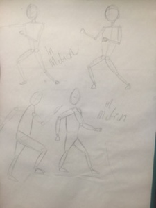
Brian then instructed us on how to draw figures in motion, this is the same as drawing still images however the limbs will be more spaced out. Movement can be achieved in many ways in figure drawing such as walking, jumping etc. many figure drawings in our interior plans will be moving to show a direction of movement within a space and to add energy within the drawing.
IMG_8413
Here i have illustrated two fighting figures (To the top) and two walking figures (Bottom) just to mix up two different styles. As long as we have established where the significant limbs are, it should be fairly easy to draw a figure in any position.

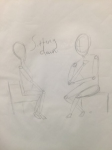
It was then time to try some ‘life drawing’, rather than copying the figures which Brian had illustrated on the board, a couple of class mates were asked to sit on chairs at the front of the class, we then had to draw them sitting down as figure people. This was slightly more difficult as we didn’t have an exact image to copy from, thus we had to establish proportion and perspective on our own. Here are my tests.
IMG_8415
I am reasonably happy with my sketches considering it was my first time doing something like this. The crossed arms were quite difficult to get around however i managed it in the end. I think after some practice and a few more lessons with Brian i will have mastered it.

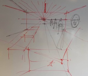
For the last part of figure drawing, Brian then illustrated how we would finally implement our figures into an interior sketch. To make the figures appear realistic and true in the space there had to be a vanishing point, this is the point which is directly at our eye level when we look to the back of a room. To give an example of this, Brian illustrated the room we were sitting in to show how we would do this.
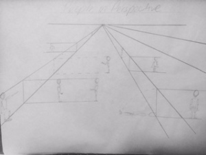
12227993_1245357195481722_1113796750_o-e1447104951196
Brians sketch. Objects/figures closest to the vanishing point appear smaller, however objects closest to us appear bigger, as this is how we see it when looking from this perspective.
FullSizeRender (4)
This is just a quick sketch i did to get myself finally putting ‘people in perspectives’ within the interior. This was just a little self projected drawing to build my confidence and to see if i could do what Brian had taught us. I am overly happy with the outcome.

I hope you have found this ‘People in perspective’ post useful, within the last two sessions we have with Brian we will be focusing on creating a tapestry of the new converted post office in Sheffield, this will be the new design studio after Christmas for all design students. We have all been given a section of the post office to draw, using any and as many different drawing mediums as we like to produce the section. When everybody’s section is joined together to create an image of the post office i am sure this will form a visually stunning piece of work.

Looking back at how far i have come, and noting that we have only two more technical drawing sessions left, i can’t help but be overjoyed and proud of myself and the work i have been able to produce. Starting out on my very first day i had no idea how i would be introduced to the course, but the things we have focused on have not only helped me understand what interior design has to offer, but has also increased my creative confidence astonishingly. I was afraid to pick up a pencil and draw at the beginning, but now i take any opportunity i can to learn new skills and accomplish new things. Exposing yourself to things you’ve never done before is the best thing you can ever do and it is only now that i have learnt this. I am excited to experience what the rest of my studies have to offer.

Scaling and Sections

Sections, multiple level, voids, stairs etc.

4737493283_7de01d1650
(Fig.1) Example of a section

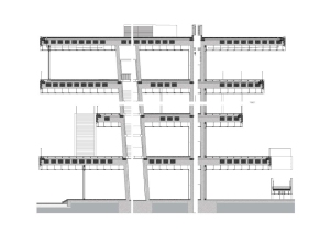
What is understood by a Section? We would represent a section as a vertical plane cut through the object, in the same way as a floor plan is a horizontal section viewed from the top. Everything cut by the section plane is shown as a bold line, often with a solid fill to show objects that are cut through, anything seen beyond the section plane would be shown as a thinner line, just to show that it is irrelevant and not the area being focused on.

We illustrate section drawings in design to translate information which wouldn’t be so easily understood from the plan or elevation. A section highlights features such as:

  • Staircases
  • Lifts
  • The relationship between different levels of a building (Voids)
  • Heights of elements
  • Lighting features

With efficiently constructed plans, elevations and sections by this point it should be easy for the client etc. to see the vision of a design space without the use of visuals, models etc.

It is most likely that a finished section drawing will have to be presented to stakeholders, therefore it may be relevant for the section to be rendered to make it more visually interesting. It is also highly useful to add small illustrations of people to the section in order to add a ‘sense of scale’ to the space.

Here are just a few examples of existing section drawings, just to get an idea as to the elements they require; Once a section rendering has been produced it is quite a visually satisfying thing to look at.

Interior Sections

Orchid House, Andres Remy Architects

1259181142-001-528x351
(Fig.2) Exterior view
1259181436-sections-01-528x373
(Fig.3) Section design

Americas’ cup building ‘Veles e Vents’ Valencia, 2005-2006

734_10_cr_070601_n58_website
(Fig,4) Long shot of Americas’ Cup Building
734_10_dm_070731_n8
(Fig.5) The interior design
734_s2
(Fig.6) The section

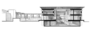
Anchorage Museum at Rasmuson Center, Alaska, 2003 – 2009

634_06_scc
(Fig.7) Section of the Anchorage Museum
634_10_cr_090515_n40
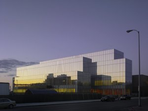
(Fig.8) Exterior photo of the Museum
634_anchorage_p1_3
(Fig.9) Floor plan of the Museum

For more amazing examples of the successes of plans, elevations and sections have a look at David Chipperfield Architects, a firm of architects with a diverse international portfolio of work such as cultural, residential, commercial, leisure and civic projects as well as master planning exercises.

 Self directed work

Following the lesson on sections, it was then our turn to have a go at drawing our own. We draw a room in plan and section at 1.100. adding a scaled persons dimensions, the scale and labels.

Room dimensions – 10000mm x 10000mm; Height – 4000mm; Step Height – 200mm; Height of window; 2500mm, finished 3500mm.

Following these dimensions i was able to construct my first to scale section drawing!

IMG_8135
Drawing up this section required a lot of precision and patience. A lot of rubbing out and redrawing was done before this was perfect.

 For the second part we then had to draw a detailed room section at 1.25 with the dimensions:

Room dimensions -7800mm; Height – 2800x2800mm total 5850mm; step height – 200mm

IMG_8164
Self directed task sheet
IMG_8165
measurements and precision are very important.
FullSizeRender (2)
My first attempt at a precision room section drawing.

Learning to draw a section to scale is very important as a designer, as this will be a basic requirement if we are constructing a plan for a client. Of course i am quite rusty at the moment and it does take quite a lot of time and thinking to make a plan like this, but after doing this a number of times i think i will get the hang of it and eventually to be able to create a section rending quickly and effectively.

Perspective drawing: Drawing the Interior

During this technical drawing session with Brian we focused on perspective again, but on a larger scale. We looked at techniques and ways of displaying perspective when drawing exteriors and also interiors, which proved to be slightly harder.  Creating a successful, true perspective drawing required adding different tonal variations by layering colours and using different mediums to define specific items and also to add texture within the drawing. This is very important if you want to construct a rewarding piece of 3-dimensional work as implementing precise tone and scale gives us a great perspective, and ultimately keeps the drawing from remaining 2-D. We learnt techniques of how to draw buildings from different viewpoints and how many artists use a fish-eye perspective technique to conceive outstanding interior illustrations.

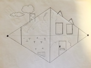
Here is a simple example of how to draw the exterior of a building using a two-point perspective technique.

FullSizeRender (1)
(Fig.1) A two-point perspective technique has been used to construct this building. The points are joined to create an isometric shape, the building is then drawn within. Here a single line render has been used with a Biro pen.

Following this, we looked through a slideshow of how different artists chose to illustrate drawings of interiors. We noticed that the artists used a fish-eye-perspective, this is a two-part projection. First, three-dimensional space is projected onto the surface of a hemisphere, by connecting every external point to the center of the sphere. Second, the hemisphere is projected onto its underlying circle. This way the interior is brought forward and the perspective of where things are in the room can be easily seen i.e. objects which are closer to us are larger and clearer. It was inspirational and interesting to see just how many different techniques of drawing there are, and once you have the basic principles of how to properly project an interior you really can create lots of beautiful drawings.
Inspirational Artist: Richard Chadwick

hand rendered marker visuals by Richard Chadwick

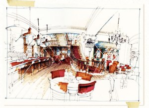
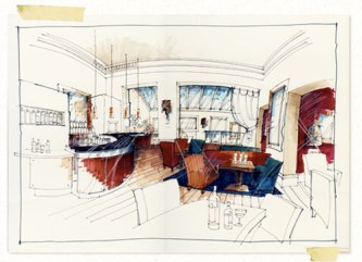
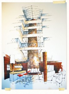
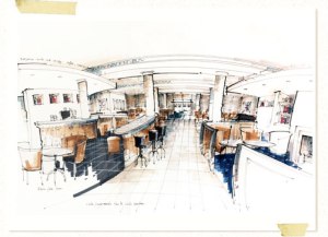
All of Chadwick’s drawings are done entirely by hand, using pen and marker renderings to capture the energy of the moment, better than anything produced by CAD in his eyes. Within his portfolio of work Chadwick also used mediums such as water colours and oils, if you want to study more about the artist have a look a Chadwick’s creative blog, otherwise, enjoy the following images of his divine work.

interior_sketches_home_page_interior
(Fig.2) Much of Chadwicks’ content is leisure industry based i.e. bars, restaurants and clubs, produced using marker pens. Chadwick has displayed shiny elements within this piece using a type of white medium to add glistening reflections off the chandeliers and glass objects.
interior_sketches_portfoilo_interior_bank_2
(Fig.3) The Bank at bury – here the artist added colours to add life to the interior
interior_sketches_portfolio_dry_bar
(Fig.4) Dry Bar Hotel, Manchester This was a re-vamped sketch-plan of the hotel, an idea to turn the upper derelict floors into a 28 bed boutique hotel. A different technique for perspective would have been used here as the view-point is elongated and coming from below.

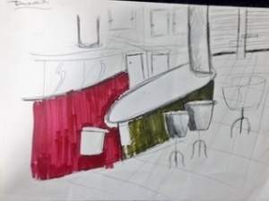
Our Turn! As a class we chose a section of a Richard Chadwick drawing to try and recreate, keeping in mind the techniques of rendering colours on top of colours and creating texture. We decided on the Merchants sketch-drawing, a restaurant and bar at the Moat House Hotel in Blackburn. This seemed like quite a relevant sketch to copy as it captured the main elements in which we were learning to pursue within out work; he created reflection within the surface of the floor by drawing neat marker lines next to each other allowing them to ‘bleed’ into each other. He adds what looks like white chalk to create the detail of the tiles and also leaves lots of whites which creates reflection. There is much depth of field in the drawing and much distorted detail, however we just chose to draw one section.
interior_sketches_portfoilo_interior_merchants_1
(Fig.5) Merchants, Chadwicks’ drawing
IMG_8140
(Fig.6) My attempt at the drawing. This was just a rough sketch, as it was just important that we understood the technique of layering colours and seeing the different tones we could make using them.

In terms of drawing materials, i used ‘kuracolours’ professional felt tips with both a thick end tip and a thin end. These are great felt tips tip layer with as each stroke creates a different colour. It would have been good to have had more time to add in a bit more detail and white chalk to add detail to the flooring, but anyhow, i am pleased with my very first try.
The self directed part

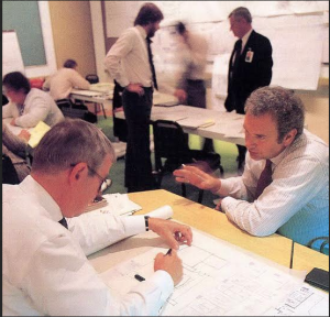
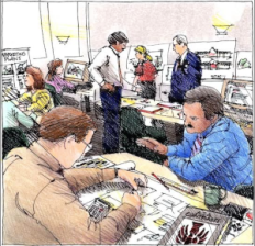
After looking at perspectives within the interior, we looked at a couple more interesting situations to draw. Brian took real life images and then traced over them to form a textured drawing of the original image. Here are the images:

screen-shot-2015-10-30-at-12-14-54
(Fig.7) The original image, two men speaking in an office.
screen-shot-2015-10-30-at-12-15-03
(Fig.8) The image sketched onto tracing paper

Self directed mission

  1. Take and print a photo of an image with a fair amount of detail in it. Then trace this image and further add lots of texture using different mediums.
  2. Do the same, this time however with an image of interior of our choice, this could be out halls of residence, the interior of a shop etc.

The hubs

IMG_8158
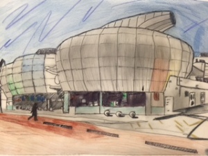
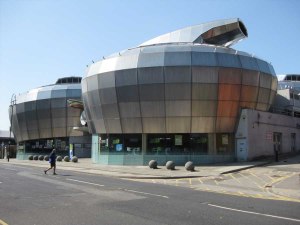
(Fig.9) My traced, textured drawing of the Sheffield hubs! Rendered firstly using line drawing and then further going over in pencil, fine ink liner, and ‘Karisma’ colour pencils. A lot of shading went on within this piece.
sheffield_hubs_aw170410_1
(Fig.10) Original shot of the Hubs, Sheffield. Perfect opportunity to play with tones and shading.

Barclay’s‘ Bank

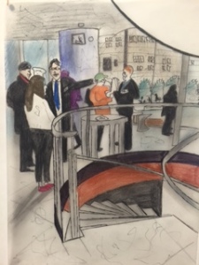
IMG_8162
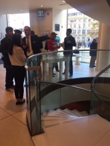
(Fig.11) My drawing of the interior of Barclay’s Bank, Sheffield. I just loved the layout of this space and i had to take a photo of it. The setting was just perfect, people in a place along with great interior elements i.e. the spiral staircase going downstairs, and the windows with the view of people and other buildings. I had much joy creating this sketch, i really didn’t know i was capable of such a thing! I decided to dress all of the people mostly in blacks, just to break up the colours and reflect the seriousness of the job. Produced by rendering ‘Karisma’ colour pencils, and shading graphite pencils.
FullSizeRender (2)
(Fig.12) Original Barclay’s Bank image. I felt this area held great interior elements and would be so fun to recreate.

This piece of self directed work has been such a pleasure and such an experience, it’s nice to realise you are capable of creating things you never knew you could! I can honestly say i have gained much confidence from this, and after looking back to all of the technical drawing i have carried out throughout this past month i do feel like i have progressed a lot. At the very beginning of starting my course i was scared to put pencil to paper, i never thought of myself as a good drawer as such as i hadn’t dabbled in much technical drawing before, but mostly photography. Within each lesson, and each blog post i have learnt something knew, gosh knows what talents will be like in a few years time!

From Sketch-model to Sketch-visual in 10 seconds

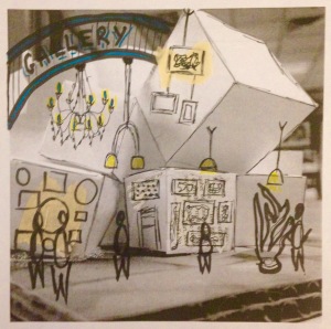
Sketch-visuals are essentially what we create as a result of making a sketch-model, they ultimately inspire our interior design projects. Sketch-visuals are designed by taking photos of our existing sketch-models, printing off these photos and further collaging on top of them, this way we get a real sense as to the purpose of the interior space and how people would accommodate it, creating a sketch-visual may further inspire us more as to how the space could be used to its full advantage.

img_2472
(Fig.1) A great example of a sketch-visual for a gallery plan. An image of an art gallery will have been printed and hen furthermore built on-top of or traced over to add colour, lighting, decorations and people. See here how the people have been stylized by the designer.
img_2961
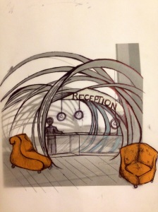
(Fig.2) A sketch visual of a reception waiting room. This sketch looks to have been traced, and then further more elements such as colour, furniture and a person have been implemented. See how the person adds scale to the height of the desk and room.

Interior elements such as lighting, people, furniture, walls and textures should be considered when producing a sketch visual, all very important aspects of an interior space. Another way to add to a sketch-visual is to also trace over the printed image and just highlight the main shapes and further add more fundamental components to highlight the schedule of accommodation i.e. desks, chairs, lighting, walls.

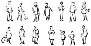
Why are people so important in sketch visuals? Adding figures within sketch-visuals creates a sense of scale inside the space, they create an atmosphere and represent the function of the space. It is important to illustrate ‘stylized’ people in our visuals as opposed to simple stick men. as these tend to look quite child like.

11272426-People-sketch--Stock-Vector-man
(Fig.3) These stylized people can be sketched in just a number of strokes with a pen and are really quick to do. See how simple but effective they are, by keeping the right scale and proportion when drawing this people this makes them appear quite realistic.

Self Directed work

After learning about the importance of sketch-visuals and how they give an overall final feel as to what a space will look like and how it will be used, it was now my turn to have a go at implementing all of these elements into my work. Firstly it was required that i learnt to draw one person in a series of seven drawing styles, this way i would know which sort of stylized people to incorporate within my future work. Secondly, i had to print four photos of different interiors including: A bar, an art gallery, a retail shop, and a hotel reception. For all of these i had to create sketch visuals, tracing over the images and adding texture by using a range of different mediums to go over the image, and also add scale by implementing appropriate stylized figures. The sketch-visual could be built up by using materials i.e. Newspaper, tissue paper, photos, etc.

**ADD SELF DIRECTED WORK**

Inspirational artist: Poy

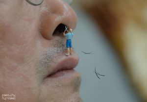
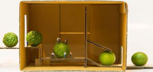
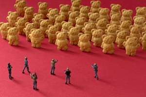
Poy is a Thai photographer with a very unique style, Poy incorporates miniature people into everyday life which changes the sense of scale to the things we see. Poy was inspired by the Japanese animation ‘Arrietty’ by Studio Ghibli, a story by where miniature people lived with humans everyday, however the humans weren’t aware. An interesting film to watch to see the effect of placing small people in a human sized environment against normal sized objects is The Borrowers,  a family film about a secret family of four-inch people living inside the walls of a house must save their home from an evil real estate developer. Other artists whom also incorporate this technique of using small figurines and creating miniature worlds to manipulate the scale of everyday objects are highlighted in 6 talented artists creating magnificent miniature worlds. Photographer and architect William Kass created a series called minimize, taking miniature toy figures and photographing them in the real world. Christopher Boffoli also uses this same technique, however he photographs his figurines with food, naming the series Big Appetites. Poy doesn’t tend to photograph his figurines in the outside world but rather places them with small objects i.e. toothpaste, drink cans etc. 

Poys’ work

POY_2938__880
(Fig.4) Placing a small figure on the human face makes the face appear much larger than it actually is. The figure is taking the position of cutting a bush.
POY_3050__880
(Fig.5) small peas and figures placed inside of a small box. Mimicking a ‘lime machine’
test_POY_4940__880
(Fig.6) Making popcorn!

Other works of likewise artists

boffoli
Christopher Boffoli
slinkachu
Slinkachu
william kass
William Kass

This technique can be personalized in many different ways and seems like a really interesting project to get into. Studying photography for two years in college i think this will definitely be something i have to try at some point, the advances and various images which could be created from using figurines with everyday objects are never ending. This is just some of the ways in which photographers choose to add scale to a situation, however us as designers have to incorporate this technique in our drawing and sketch-visual pieces.

Elevations and Celebrations

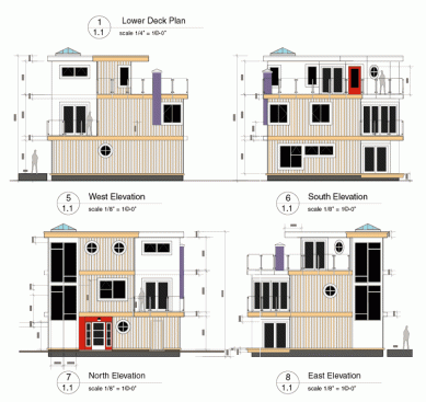
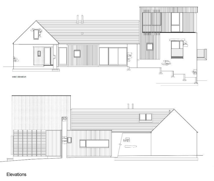
As we understand a section to be an illustration of a building although it has been sliced directly through the middle, an elevation is the view of this interior space or building from one side with no perspective, however, an elevation gives you the chance to see everything from other viewpoints. Elevations are a very useful part of the planning process as it gives a sense as to the internal wall layout and design and also shows what the building will look like externally.

*3 elevation photos*

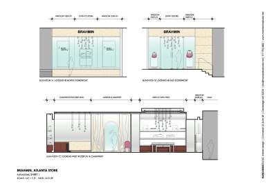
An elevation will be produced once the floor plan has been established as it is only then that all elements of the interior will have been established i.e the floor, doorways, heights of internal fittings and furniture, equipment etc. Elevation indications make it easier to understand whereabouts on the floor plan the elevation has been taken from.

atlanta_elevations-1-2_rendered_page_11
An example of an elevation plan, the bottom image shows the section of the floor plan where the elevation has been taken from. The top images show the north and east elevations of the front of a shop.
elevations
This image shows the North, East, South and West elevations of a float home in Victorias West bay Marine village.

However, as many buildings rarely tend to be a simple rectangular or square shape, it is often that an ‘extended elevation’ will  be constructed which allows for features which continue around two or more walls to be seen.

Self Directed

Shape and Geometry: Think, experiment, and test…

collage_triangle_by_pallala-d3ib0kk
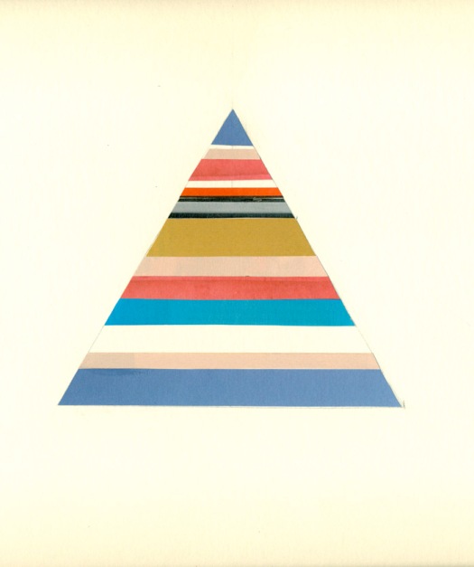
(Fig.1) Triangle

Through creating shape boards, we can translate a visual representation of how through exploring, thinking, experimenting and testing, we can make simple shapes appear interesting, and flatter them by using clever juxtaposition techniques. By getting an object, piece of inspiration etc. and displaying it in different situations and angles gives designers inspiration as to ‘outside of the box’ thinking, and further from this, new design concepts can be made which eventually make the creative design project.

marques-de-riscal-frank-gehry-sugarfly-mindy-joyce
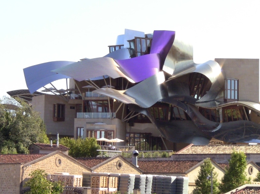
(Fig.2) Frank Gehry’s Marques de riscal hotel.

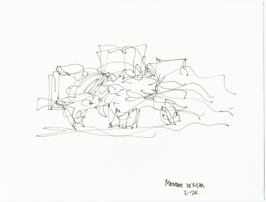
The famous Marques De Riscal hotal, designed by Frank Gehry, is a great example of how designers can gain inspiration from small, everyday things. In this case, Gehry was influenced by the movement of wine.


I quote “The architect wanted to infuse his work with the signature colours of Marqués de Riscal: pink like the wine, gold like the mesh on the Riscal bottles, and silver like the bottle top.” – http://www.marquesderiscal.com/seccion_menueng.php?a=43

riscal_12
(Fig.4) Gehry copied the chaos of a wine spillage by illustrating the form on a piece of paper, this formed the basis for his hotel design.


This theory session was spent exploring, thinking, experimenting, and testing the creative advances of simple shape and geometry through practical exercises. The task was to create our own A3 shape board to represent the triangle, and no a triangle isn’t just a triangle as we know it, it represents trinity, harmonious stability. We were to split the A3 board into 8 segments, in each we could display the triangle in many ways I.e. folding and origami, cutting, 2D and 3D structures and collaging. To enhance our approach to the task and to see the true success of creating a shape board we were told to incorporate repetition, be creative, understand that there is no right and wrong approach, and to also use different materials.

Inspiration can come from anything, no matter how ridiculous or silly it may be, certain sound patters can inspire us, an plastic bag floating through the air may inspire us. It is a good idea for a designer to always carry around a sketch book so we can jot down these everyday things which may, in time, come together to give us the greatest design concept of our lives.

Self Directed Process: The Perfume Shop

So we began this piece of self directed work in our in interior design session with Rachel, we then took it home to finish and photograph. We were asked to produce a sketch model and a sketch visual using inspiration for either a watch shop or a perfume shop, of course being a girly girl i chose the perfume shop. I spent around 15 minutes just looking at inspiration for what forms and elements i.e. colour, texture, which would feature within my perfume shop, i focused on researching different flowers which tend to be used to make beautiful fragrances. I came across a the beautiful jasmine flower, small white flowers which bloom amidst big green bushes. I noticed that the jasmine bushes become so big that they begin to dangle, creating a beautiful contrast when placed among buildings, this is when i got the idea to focus on a sketch model acquiring all of the elements of the jasmine plant.

94bc308078fadf73a22a3a12c0ee72be
(Fig.1) Jasmine being featured an an indoor feature, gave me the inspiration for a flower featured wall within my perfume shop
f09a1ae1ec4a3ef833b9410b812fa458
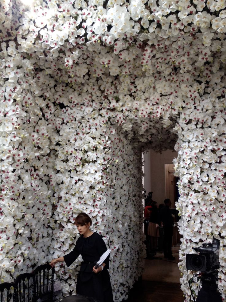
(Fig.2) A more extravagant use of flowers, gave me inspiration to possibly create a doorway feature. However the inspiration i took from this was the actual depth of field and angle this photo was taken. I wanted to photograph my back wall through a doorway, this is what i would like my potential customer to see when walking through.
jasmine
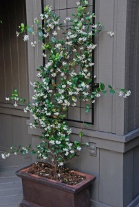
(Fig.3) This was the final photo which gave me inspiration for how i would actually display the jasmine on my sketch model. I will create this falling shape using different materials, mimicking the natural form of the jasmine plant.

The sketch-model: How i did it

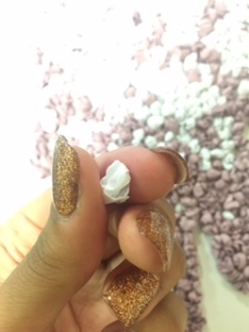
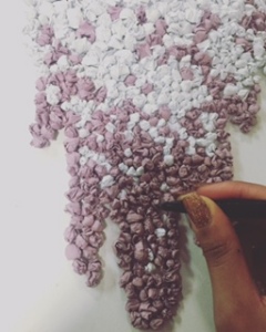
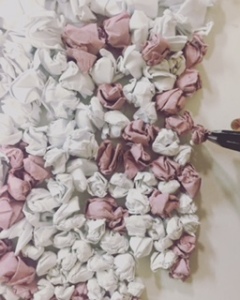
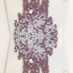
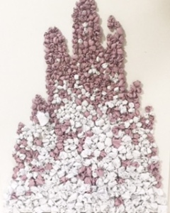
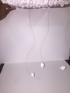
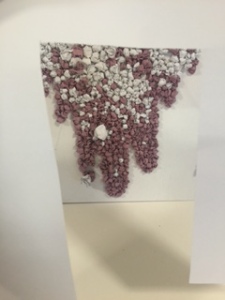
I instantly knew exactly how i wanted to construct my sketch-model wall feature, i created the jasmine blooms using bits of pink and white screwed up paper patiently gluing every little piece to a white base until i eventually achieved the fullness and shape i wanted. My perfume wall embraced all of the important elements i wanted it to, i created texture with the use of rolled bits of paper, i achieved form by drawing a faint outline for my wall feature, and i incorporated pinks and whites within my piece just to give an elegant, easy on the eye feel to it. Using fish wire i dangled three bits of screwed up paper from the top of the sketch-model, just to add to the 3-D effect and suggest that this wall feature would pop out to the potential customer and be a real eye-catching piece of interior design.

Sketch Visuals

FullSizeRender (1)
(Fig.4) The long task of screwing up pieces of paper to form my jasmine bush wall feature.
IMG_8051
(Fig.5) Infilling the gaps, adding fullness
IMG_8052
(Fig.6) Neatening up the edges, creating a shape
IMG_8053
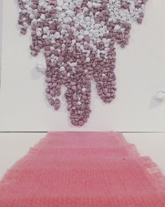
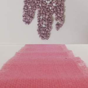
(Fig.7) Here i try to make the viewer feel as if he/she is the customer walking into the perfume shop, looking straight ahead to the featured wall. I used pink jute roll to mimic a rug, this also leads the viewers eyes straight to the back wall.
IMG_8055
(Fig.8) here I duplicated one image of my sketch-model and mirrored them opposite of each other. My aim here was to consider the idea of possibly having the feature continued onto the ceiling from the back wall, I think this would be very effective.
IMG_8056
(Fig.9)
IMG_8057
(Fig.9) A basic image of the finished sketch-model. Flipping the image to this angle just gives us a different perspective, possibly lay down on the floor looking up to the feature on the ceiling?
IMG_8009
(Fig.10) The additional pieces of paper attached with fish wire. These elements translate that the feature is 3-D and elevated from the wall.
IMG_8014
(Fig.11) This photo isn’t taken at the best of angles, but shows a perspective view from the doorway of the perfume shop. If this small piece of self-directed work was an extended project i would have had fun creating a stable doorway to match the jasmine feature wall. Inspiration (Fig.2)

The Schedule of Accommodation within my perfume shop

A schedule of accommodation in design/architecture is basically a brief of the interior layout of a space and how that space is intended to be used. Things to consider when writing up a schedule of accommodation are finishes, furnishing i.e. will there be sitting areas? where?, where will the till area be? Environmental conditions will also be considered i.e lighting conditions, temperature, air movements, acoustic isolation etc.

Firstly, the main colours to be featured within my shop will be glistening whites and nude pinks. There will be no isles within the shop, perfumes will be displayed in glass cabinets both on the left and right wall, four of the most exclusive perfumes will be displayed on tall individual glass stands vertically in the center of the shop, all with bright spotlights shining directly onto them. All of the walls will be plain white, with the wall feature just appearing on the back wall and also carried onto the ceiling. The flooring will be entirely made from pure white marble, as this will create a classy, clean feel when the white spotlights reflect off it. The till area will be a basic rectangular shape desk also made from white marble to keep an ongoing settling theme throughout the shop. On either side of the perfume displays in the center of the shop there will be two white velvet chaise lounges, giving customers a place to sit and relax during their visit. Hopefully you are getting an idea of what the layout of the shop would look like and the intentions of the mood? Considering environmental conditions, the lighting will be achieved through a number of white spotlights on the ceiling, spotlights above the perfume displays will be slightly brighter of course to grab the attention of customers. There will be a light aromatic jasmine fragrance breezing through the shop, the scent will have calming properties instantly making the customer feel relaxed. Finally, the room will be of a cool temperature with fans in either corner of the room, the intention of this is to create air movement which also relaxes everybody occupying the space. Here are a few inspirational images, just to understand the mood of my perfume shop idea.

The Mood

3114384-0489230106-white
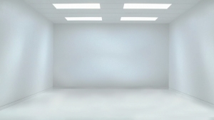
(Fig.12) Idea of a plain white room with lights coming from above. This simplicity is extremely effective
1396158314
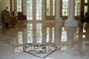
(Fig.13) The reflection of light off a white marble floor can be seen here, as intended for the perfume shop.
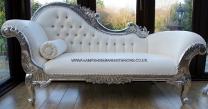
(Fig.14) White chaise lounge
(Fig.14)


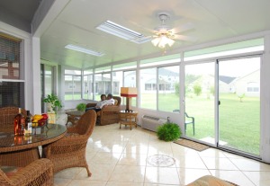
inside-sunrooms-interior-with-rattan-furniture-and-ceiling-fans-with-lights
(Fig.15) The fan idea. Lighting coming from the fan as well as the spotlights is also an effective interior feature.

For more inspiration and an idea of the features i intend for my perfume shop to have, take a look at Grand pacific. The interior decor here features some of the classy, simple elements which i wish to hold within my perfume shop idea. I hope this post has been quite inspirational to read!

Bibliography

(Fig.1) Indoor Jasmine, https://uk.pinterest.com/pin/457467274625152522/

(Fig.2) Jasmine flower doorway, 29.10.15, https://uk.pinterest.com/search/pins/?q=jasmine%20plant&term_meta%5B%5D=jasmine%7Ctyped&term_meta%5B%5D=plant%7Ctyped

(Fig.3) Form of the Jasmine plant, 29.10.15, https://uk.pinterest.com/search/pins/?q=jasmine%20flower&term_meta%5B%5D=jasmine%7Ctyped&term_meta%5B%5D=flower%7Ctyped

(Fig.12) Plain white room, 29.10.15, https://www.pinterest.com/pin/347269821245313355/

(Fig.13) Marble floor, 29.10.15, http://www.gharexpert.com/articles/Marble-Flooring-2151/White-Marble_0.aspx

(Fig.14) Chaise Lounge, 29.10.15, http://www.hampshirebarninteriors.co.uk/furniture/chaise-lounge

(Fig.15) Room with Fans, 29.10.15,

Fail to plan, plan to fail…

What is a Plan?

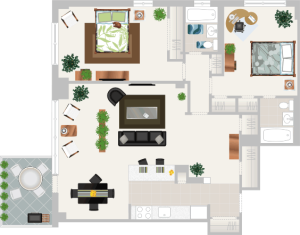
Plans are diagrams usually drawn to scale which show rooms, spaces and other physical features at one level of structure of a building.

Examples of Plan Layouts

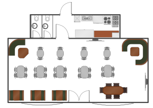
Café-Floor-Plan-Example
(Fig.1) As you can see objects have been simplified i.e. doorways and seating, all we need is a simple example of where things will be positioned.
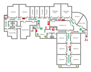
school-layout
(Fig.2)
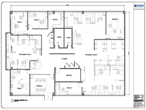
4d2e4c94681cb_Trident_3
(Fig.3)

A plan is a map of a building or room, and is drawn from a Birdseye view as if we have sliced off the top of the building and drawn from this perspective. A designer would have to draw a plan for a potential client as this is the only way to see what an intended building/space would look like. The diagram would need to include entrances, doors, walls, stairs, columns and also furniture and fixtures if this is what was planned in the finished space. Drawing symbols are a great way to translate objects in a plan and simplify them, as it would take too much time and effort to draw each object exactly how it is. Plans also show how a person would move through the room or building, and ultimately give a feel to how the space would be used by the inhabitants.

Graphical Symbols

Graphical symbols give plans an explanation without using language, distinct symbols show the client etc. what the designer is trying to portray without being too technical on the drawing. Plans should be rather quick to produce depending on the scale of the project, therefor detail of such attributes just wouldn’t be necessary.

Drawing symbols

When drawing symbols on a plan, they should be simplified but still drawn to the correct dimensions just on a smaller scale, of course because it would be just impossible to draw a plan to scale! It is important to label each object throughout the plan with the name and dimensions so it is understood by both the client and designer what the object is. It is also important to use different line styles when producing a plan, as different lines mean different things. A thicker line would suggest a stronger, more dense material, and a thinner line would suggest a temporary or much lighter material being used for the walls etc.

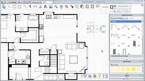
cad
(Fig.4) As we can see in this CAD plan, fixtures, walls and objects such as the doorways, toilet, and walls have been simplified, yet they remain very effective in the plan. It is easy to see the general flow of the building throughout this floor plan and a client would get a general sense as to whether this would be suitable or not.

Different types of planning

Site Plan

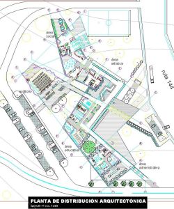
A site plan is an architectural plan of a given area or community as opposed to just a building or room. A site plan would encompass a whole range of land and buildings, thus making it slightly larger scale than just a singular building plan. A site plan would generally show road plans, landscapes, waterlines, paths etc. which would all be translated through drawing symbols as discussed earlier. A site plan would be constructed in order to either develop on an empty piece of land or, to improve an existing site to make it more practical and up to date with social changes etc.

800px-PLANTA_proceso
(Fig.5) a site plan example

Floor Plan

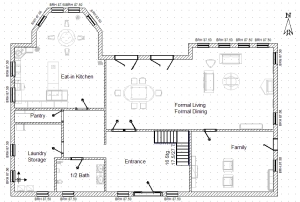
A floor plan shows a Birdseye view of one floor of a building, this type of plan would generally show entrances, walls, rooms, objects to be used in each room and doorways. This plan will not be an elevation as it is just one floor we are viewing from above, therefor it is not necessary to see the plan from an elevated side angle.

floor plan
(Fig.6) A Floor plan example

Furniture plan

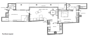
A furniture plan can be drawn up only after the floor plan has been created as the floor plan depicts the arrangement of the furniture in the specific area. A furniture plan comes to use in cases i.e. a kitchen plan, once the floor plan is constructed the furniture plan would then imply where chairs, tables, bins etc. would be positioned. You cannot accurately create a furniture plan without an efficient floor plan.

Furniture-Layout
(Fig.7) Furniture planning has been achieved here as the floor plan was successful, therefor it is relevant to add more detail in order to progress within the planning process
h-over
(Fig.8) A bit of a friendlier illustration of a furniture plan, the designer has even added the colour scheme of specific objects all the way down to bed covers.

Ceiling and lighting plan 

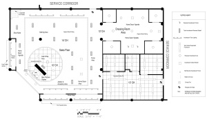
Of course it is quite obvious what a ceiling and lighting plan would involve? Maybe this imagine will explain better.

copy-of-relfected-ceiling-plan2
(Fig.9) Basic plan of a ceiling and lighting plan with a key.

Yes it really is that simple, a designer would finally configure a ceiling and lighting plan after the floor plan and furniture plan have been determined. It is only now that the designer can really say what lighting goes where as a general flow has now been created within the space, therefor it would be known by the client what lighting fits best and where. It is helpful for a key to be drawn aside with the plan just so the client can easily see what the specific light symbols are.

bibliography

(Fig.1) Plan Layout 1, 28.10.15, cafc3a9-floor-plan-example.png?w=300

(Fig.2) Plan Layout 2, http://www.mehve.net/dba11abe44105751-building-a-scale-of-floor-plan.html

(Fig.3) Plan Layout 3, http://www.villageconcepts.com/mill-ridge-village/floor-plans/

(Fig.4) CAD plan, http://www.floorstyler.com/

(Fig.5) Site plan, https://en.wikipedia.org/wiki/Site_plan

(Fig.6) Floor Plan, www.mosikalsimage.tk

(Fig.7, 8) Furniture Plan, https://plan-symbols.com/classic-furniture-symbol/

(Fig.9) Ceiling and lighting plan, http://adoreyourplace.com/2013/01/08/lighting-wow/

Reproduce, Interpret and Respond.

week 11. 8.10.15

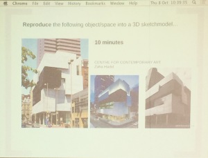
Starting on a new project this week, this lesson was about understanding what sketch models were, and how we could reproduce, interpret and respond to images shows on the screen using sketch models.

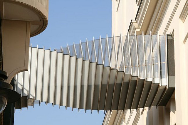
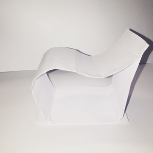
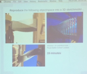
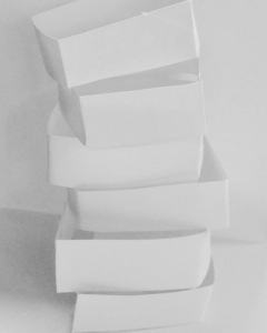
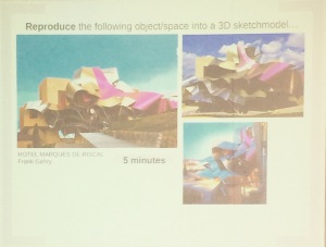
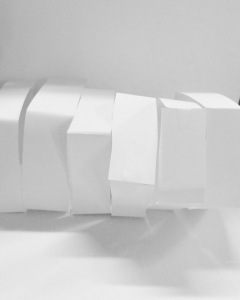
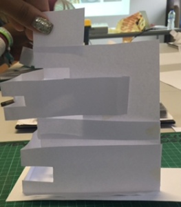
For the first part of the lesson we ‘Reproduced’ the image we were shown on the slideshow; for this we needed plain paper, a cutting mat, a scalpel, and of course our personal creative flare. Here are some images to show the was in which i decided to reproduce and respond to the photos shown:

This is the image which the class then had to reproduce
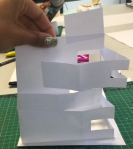
My sketch model in response to the image shown - made with paper.
My sketch model in response to the image shown – made with paper.
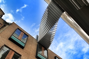
The image shown - Bridge of Inspiration, London.
The image shown – Bridge of Inspiration, London.
The-Bridge-of-Aspiration-from-the-outside
Bridge of Inspiration, London. (daniel,2015)
bridge of inspiration, London. Soure: https://www.google.co.uk/search?q=royal+ballet+school+london&biw=1366&bih=705&source=lnms&tbm=isch&sa=X&sqi=2&ved=0CAYQ_AUoAWoVChMIrIOQwPLMyAIVQmoaCh1aoQWz#tbm=isch&q=bridge+of+inspiration&imgrc=3lmD4b7gfrWc7M%3A, 18.10.2015
bridge of inspiration, London. (LonelyPlaces, 2016)

IMG_7746

My sketch model copies, made from paper.
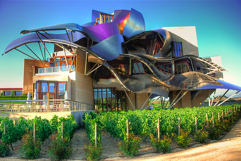
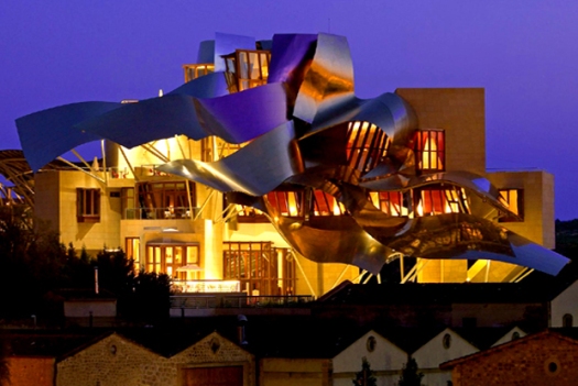
Image shown - Hotel Marques De Riscal
Image shown – Hotel Marques De Riscal
009_frank_gehry_hotel_marques_de_riscal_elciego_theredlist.png
Hotel Marques De Riscal. (2013)
travel-marques-de-riscal-m.jpg
(gehry, 2006)


My sketch model copies

IMG_7746

Image to Reproduce
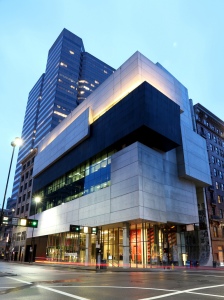
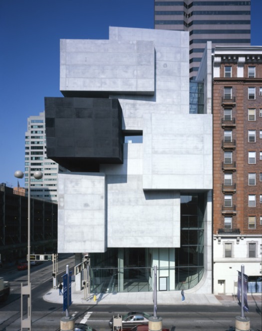
Image to Reproduce – Centre for contemporary art, Zaha Hadid
Centre for Contemporary Arts
Centre for Contemporary Arts. (Fiederer, 2016)


contemporary-art-ohio-2.nocrop.w529.h670.jpg
Zaha Hadids Centre for Contemporary Arts. (UserName, 2016)

My sketch models in response to the Centre for Contemporary Arts


My Sketch Models

FullSizeRender (3)


The Dream Space Project

29.05.15

Tuesday Studio Session with Colin, Ranbir, Rachel

As a class we looked at a slide show of artists work, this work was of paintings, buildings and sculptures. All of the work represented dreams, and we discussed how we believed each piece of work could be incorporated into dreams. Much of the artists work was made up of different shapes, patterns and monotones, but nothing too specific, meaning we could understand the work in our own way as it was rather abstract. Looking at this work gave us inspiration as to what we were about to do for our next project.

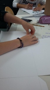
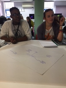
In groups of 5, we were asked to create one drawing, and one model per group to represent ‘dreams’ in any way we wanted. From looking at artist work we had all gained inspiration by this point, therefor we could all put together our own personal ideas to create some stunning work. Here are some images to show our thought process:

Our first sketch model

SubstandardFullSizeRender
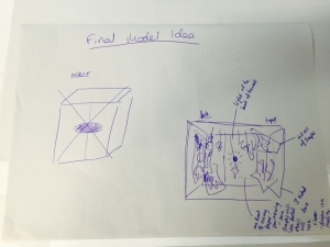
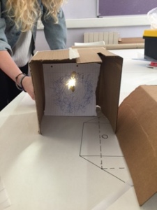
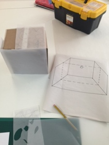
(Fig.1) A quick sketch of what out dream space model will be. We had the idea of a light box, shining through sheets of tracing paper with cutouts, therefor projecting different images out of the box.
IMG_7342
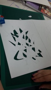
(Fig.2) Tester sketch model: this is the idea of cutting small shapes out of the paper, light will shine through these cut outs to create the shadows onto the paper at the front.
IMG_7343
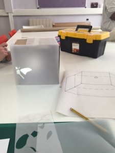
(Fig,3) Playing the ‘shape paper’ into the box mock up
IMG_7347
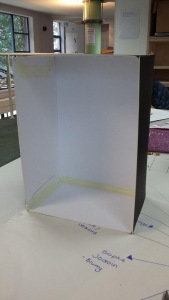
(Fig.4) A more detailed drawing of the box idea, against the prototype of of ‘Light box’ sketch model. By this point we had attached the tracing paper to the front of the box and places the paper with cut outs inside.
IMG_7348
(Fig.5) Of course before we went on the create the real thing, it was important that our light projection idea actually worked, and it did! We tested this by placing a phone light through a peephole at the back. The shapes successfully shone through onto the tracing paper!
IMG_7346
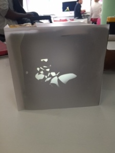
(Fig.6) More cut outs were made, just to see the effect. Quite pretty. The whole idea is that the box is our brains when we are asleep, and the shapes, figures and forms we see through the light projections are our dreams.

The drawing

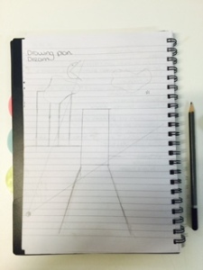
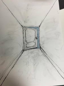
We came up with the idea of illustrating a simple doorway image for our drawing, the person looking at the drawing would be the person dreaming and the slightly ajar doorway at the end represented waking up from that dream. Standing before the dreamer is a long hallway which represents how long our dreams actually last, how quickly the dreamer wants to wonder towards the open door is entirely up to them. Behind the slightly open door is a blue sky, representing the relief and happiness from waking up from many of our dreams. We kept the drawing very simple as we wanted the ‘dreamer’ to interpret it in their own way, without being lead to think of a their destination.

FullSizeRender (3)
(Fig.7) Initial drawing dream space idea.
FullSizeRender (4)
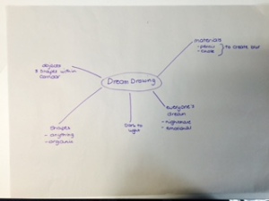
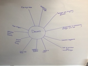
(Fig.8) Brainstorming with the group! It is always good to get everybody’s ideas together and discuss them. The mind of a designer is a wonderful thing.
IMG_7333
(Fig.9) What could we dream of?
IMG_7334
(Fig.10) The thought process within our group.

The Model

For the 3D model we came up with the idea of blurs and distorted images, as within dreams the people and things we see are most often hard to comprehend or may look as two contrasting things; We brought this feeling to life by thinking of creating shadows. Before going ahead with the real model we created a prototype to see if the final creation would work. Using a piece of scrap card, tracing paper, and the torch from a phone, we quickly made a rough model which turned out just as we hoped.

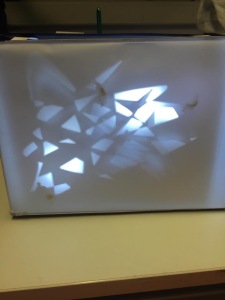
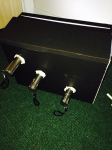
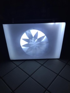
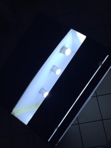
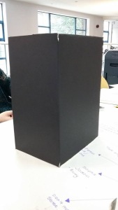
To create our final model, we got a plan black box and covered the front with one piece of tracing paper. In the center of the box is a slot where three different pieces of white paper can be inserted, all with different cut of images and shapes on them. To finish this model we attached three small torches to the back of the box to create the shadows through to the tracing paper. This had an amazing effect, and was actually much more successful than we thought it would be.

IMG_7391
(Fig.11) all photos below are the process of creating our final box. We created it using firm black board with a white interior. Precision and measurements were important for our box to fit together perfectly.


IMG_7395 IMG_7396 IMG_7394 IMG_7393 IMG_7392

The final sketch-model images

IMG_8061
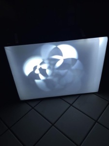
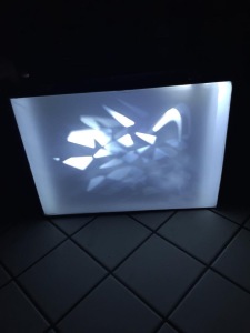
(Fig.12) The projected shapes here were made by creating random cut outs on the tracing paper on the interior of the box. This piece of paper can be removed and changed simply by lifting it from the top and replacing it with another. These shapes highlight how un-constructed and puzzling our dreams can be sometimes. We added two layers of cut out paper which added to the different strengths of lighting through to the tracing paper at the front, this creates a great effect.
IMG_8062
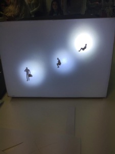
(Fig.13) We wanted to implement human figures into our sketch-model as we always dream about people, but sometimes they can become displaced and distorted within our dreams. I wont explain too much into it, and the idea really is to understand and interpret the project in a personal way.
IMG_8063
(Fig.14) We projected light through by gluing three torches through holes at the back of the box. Posh.
IMG_8064
(Fig.15) A different shape cut out has been implemented here. We took images of our dream space sketch model in the dark in the ladies toilets so the different forms and shapes could be seen in more detail.
IMG_8065
(Fig.16) And again…
IMG_8067
(Fig.17) And again…
IMG_8068
(Fig.18) The torches

Although there is a meaning to each and every one of the dream space sketch models which were made, the intention is to interpret the models and drawings in your own way. We are all different, therefor each piece will highlight something different to us, this is why it was important to implement many forms within our work as these can easily be understood in our own way.

The final Drawing

IMG_8069
(Fig.19) Initially it was out idea to add symbolic images around the doorway to signify dreaming patterns and nightmares, however we decided that this may be too leading for peoples imaginations. By displaying just a simple ajar door at the end of a long doorway, this gets the viewer to think about what is going on in this situation. Does walking down the corridor signify us falling asleep, and the doorway at the end us going into our dreams. Or are we already dreaming? and the doorway at the end signifies the end of our dreams and us waking up? What is beyond the door? Happy dreams or nightmares? It’s honestly up to you.

The Dream space project has been an amazing project to set me off in the right direction as to what the course is going to entail. Different, unique thinking, thinking outside of the box at all times and being innovative and using initiative is what its all about. The project taught me that no thought it too ambitious and to just put my all in 24/7, every idea is worth hearing and being able to work effectively in a group shouldn’t be under estimated. Brainstorming and seeing the dream space projects of other groups was also a learning experience, to see what different techniques and materials other designers used was really helpful, it truly opens your eyes to the advances of the design world.